The Challenge
Pastel Bank is an established financial institution that has recently taken on the challenge of online banking. Customers had been asking for a native mobile application in order improve the online banking experience on their responsive web platform.
Duration: 1 Week
Team Members: Julia Laing, Tori Solomon, Ryan Fatica & Natasha Anwar
Method: Design Sprint
The Sprint Process
Specifications
Designing for specific brand means considering existing guidelines and frameworks, along with technical requirements that must be included.
Avenir was the selected as the primary typeface, and the primary brand colours can be seen on the right.
Technical Requirements:
- Accounts are associated with Client ID #
- Displayed balances must support up to 11 digits
- Minimum required account type: Chequing, Saving, Credit
- Signing up must be prioritized over signing in
Target Market
Young Professionals
Young, 20-something adults who have completed post-secondary education in the last 2-5 years. For the first time in their life they have disposable income, but are also looking to understand saving and paying off debts.
The Problem Space
36%
of millennials use banking applications, as opposed to 23% for all demographic groups
of millennials use banking applications, as opposed to 23% for all demographic groups
66%
of millennials have nothing saved for retirement
of millennials have nothing saved for retirement
Theme extraction from user interviews
HMW planning and current trends
Extracting themes from our initial research and user interviews by sorting them as pain points, motivations and behaviours, we were able to conclude that young professionals wanted and easier way to manage their savings and spending habits. Common motivations included travel, latest technology, and expenses such as rent or debt.
How Might We...
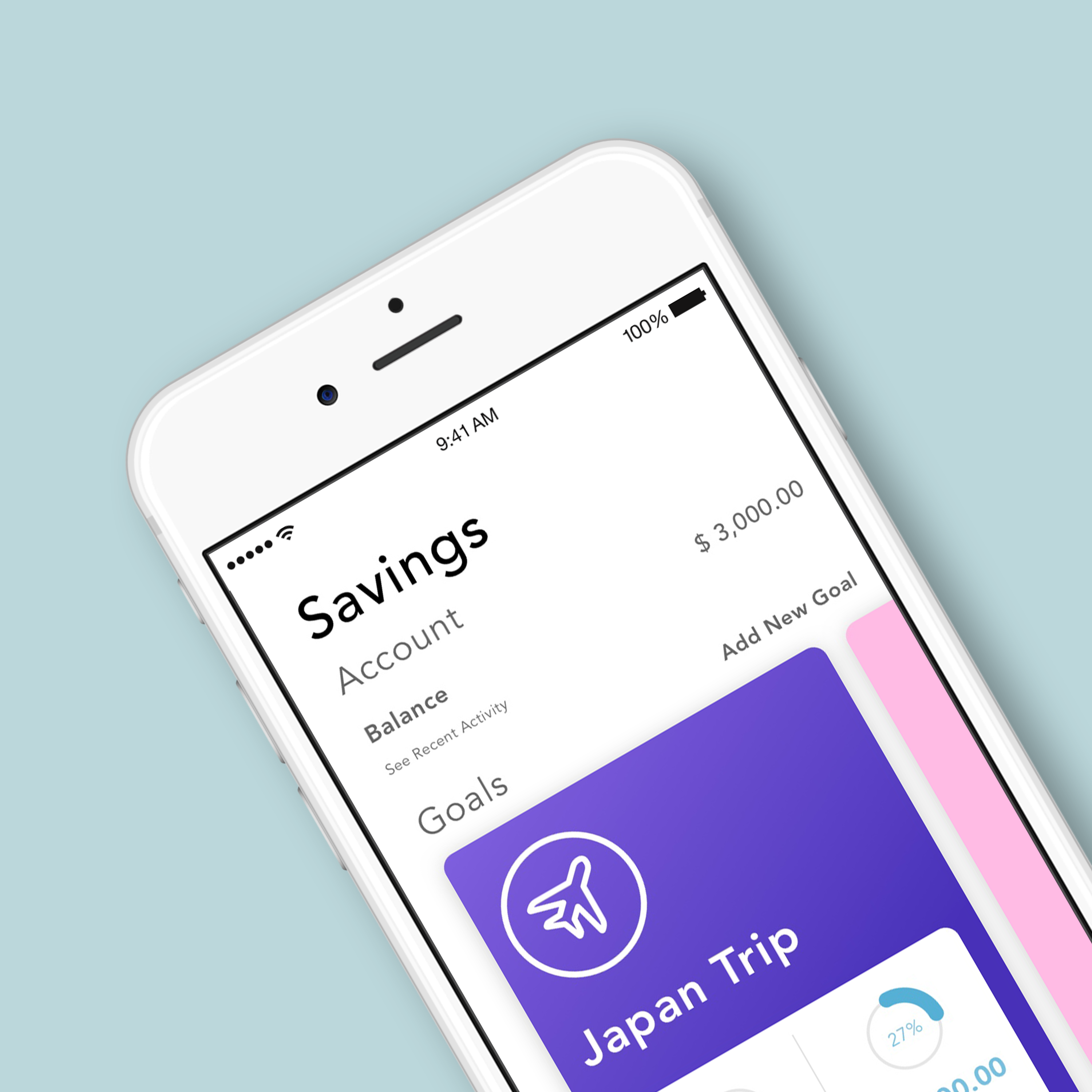
help young professionals be more aware of their spending so they can attain their savings goals
Persona
Storyboarding
Understanding Tristan's journey through a narrative helps us empathize with scenarios in which the native app may be useful, but also aids us in narrowing down our task selection.
Assumptions
- Tristan already has a bank account with Pastel Bank, however he is new to the native mobile app banking experience
- Tristan has an idea of specific savings that he would like to achieve associated to his bank account
- Tristan is a an iPhone user
Storyboard of Tristan's Journey
Ideation & Sketching
After sketching several different versions of our user flow, we were able to vote on designs based on a dot voting system.
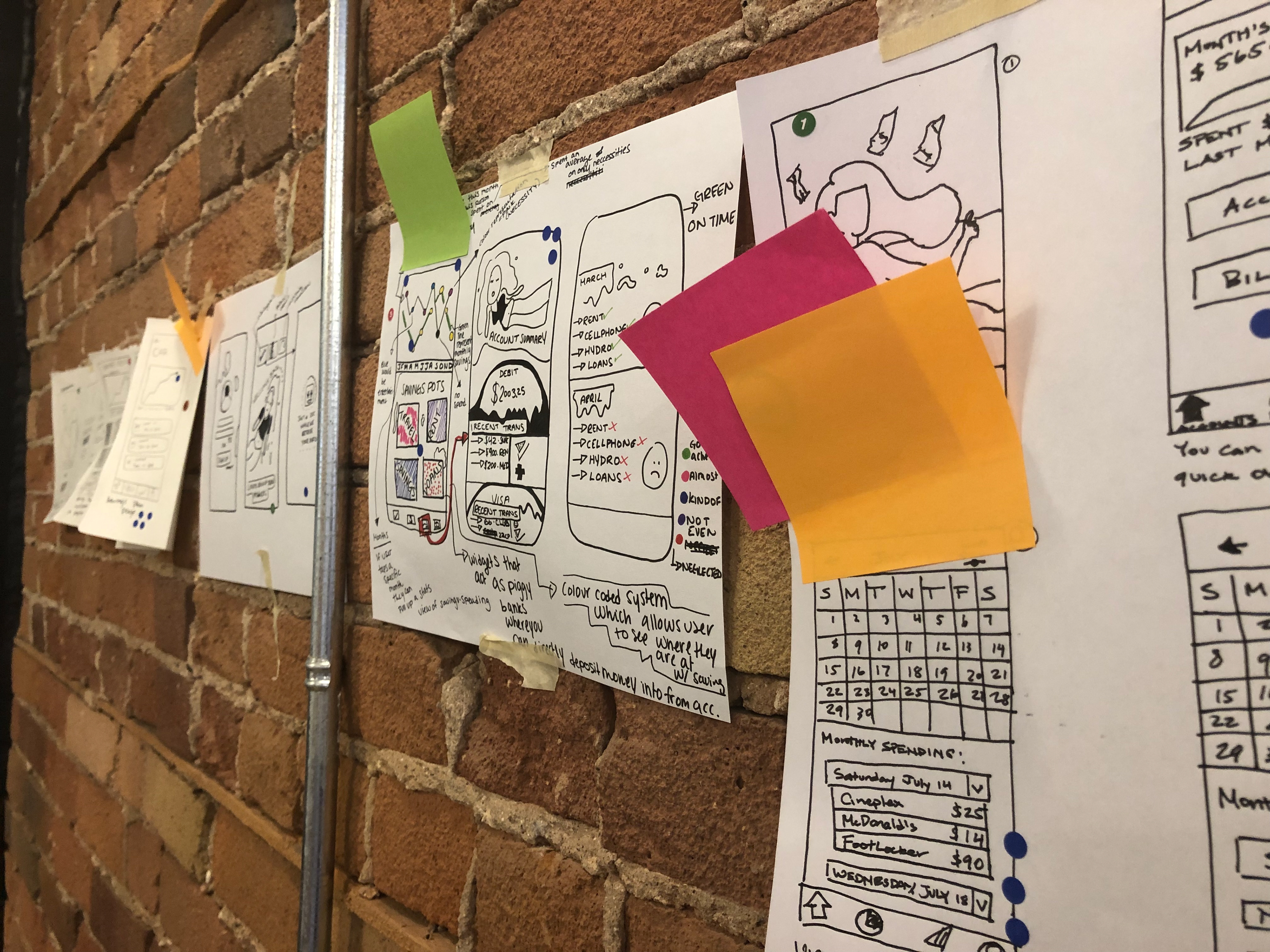
Museum voting

Sketch museum for dot voting
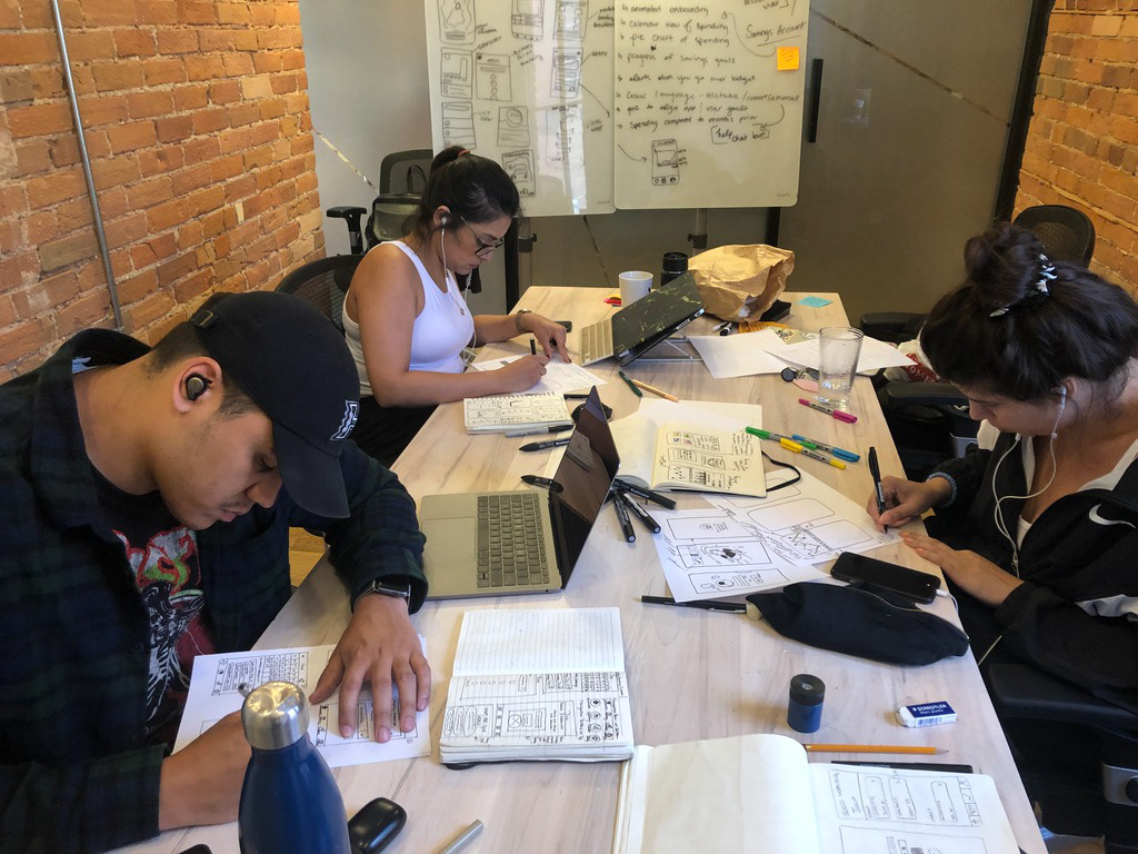
The team working on Crazy 8 sketches
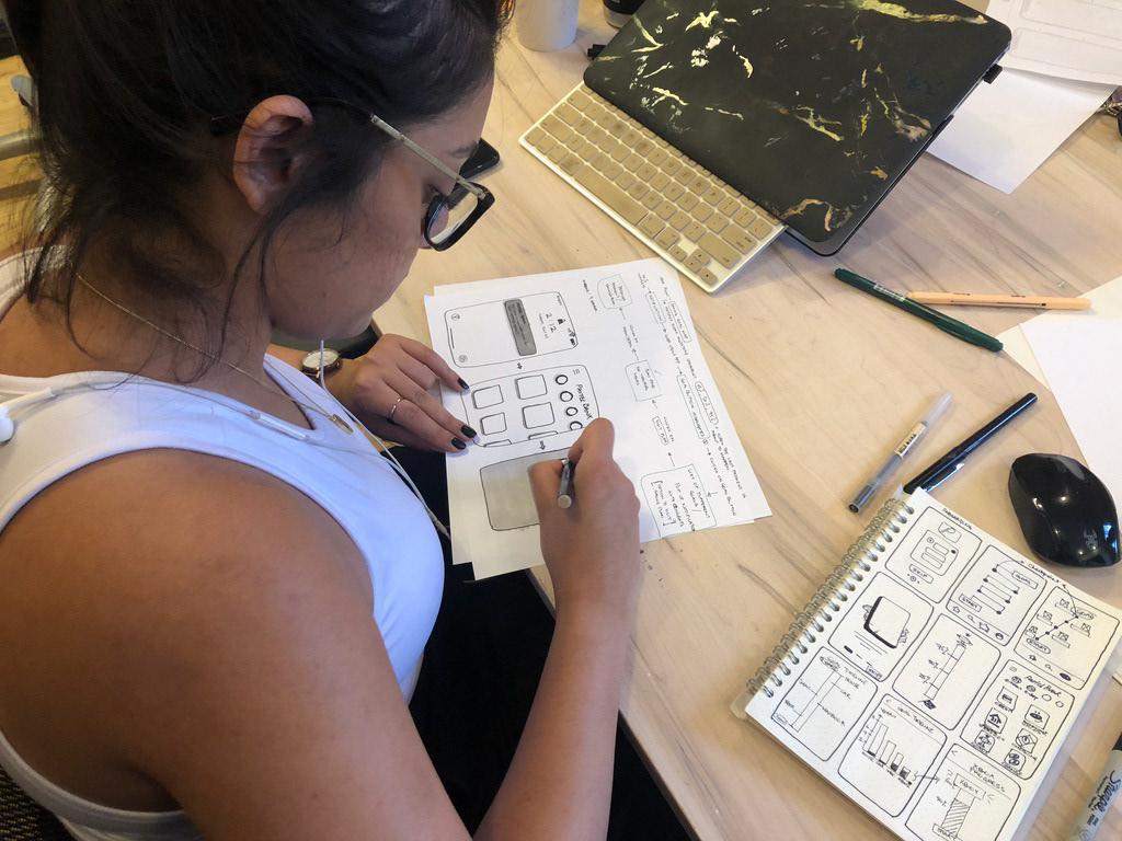
Natasha working on sketches
The Design
Usability Testing
With the clickable prototype ready to go, we were able to conduct usability testing to validate our concepts.
Through multiple moderated usability tests with users, the team was able to validate concepts and discover areas of opportunities
Validations
- Intuitive Sign Up Experience
- Appealing visuals for onboarding
- Functional visual goal tracking
- Easy to follow iconography
Opportunities
- More information for visual graphs
- Simplify home page
- Improve button functionality
- Reduce overcrowding
Sprint Takeaways
This entire experience was a great way to collaborate other designers and work in a team to achieve a common goal. The tight deadline was extremely effective at ensuring that we were able to stay on task, and allowed us to prioritize and divide and conquer. I was fortunate enough to have an incredible team to work with which made this whole process really enjoyable.
