Introduction
A screen redesign for a client-facing responsive web platform to solve discovered usability issues. Due to the urgency for solving this problem, this project was expedited to ensure an adequate amount of time to build it out.
Duration:
Role:
Methods:
Deliverables:
4 Days
UX Designer
Heuristic Evaluation, A / B Testing
Desktop and Mobile Screen, Menu Overlay

What is Subtraid?
Subtraid is the next-step in simplifying project management in the construction industry. Aimed at helping subcontractors, builders and general contractors achieve their business goals, Subtraid offers an all encompassing productivity software that increases efficiency, while reducing the margin of error.
Some of the benefits that Subtraid offers include automated invoice and estimates for clients, direct communication of task assignments to workers, and utilizing analytics to optimize business practices all while providing a platform to easily manage all projects in one place.

Visit www.subtraid.com to learn more about the project.
The Task
Subtraid's client-facing responsive web platform offers an easily accessible "Projects" page, which serves as an overview of all available projects at a given time. Each project on this page has task boards associated to it, where the client can sort tasks and deliverables based on a personalized organizational system.
Project can also have sub-projects associated to them, therefore there is a hierarchy of information that must be displayed in order to show the association between the parent project and sub project. The issue with the current system however was that there was no differentiation between these two categories.
Project can also have sub-projects associated to them, therefore there is a hierarchy of information that must be displayed in order to show the association between the parent project and sub project. The issue with the current system however was that there was no differentiation between these two categories.
That is where I come in.
Technical Requirements:
- Use existing information architecture and design it in an intuitive way
- Maintain consistency with existing user interface
- Add a search feature
- Add a filter feature
Initial Screens

Current Project Overview Desktop Screen
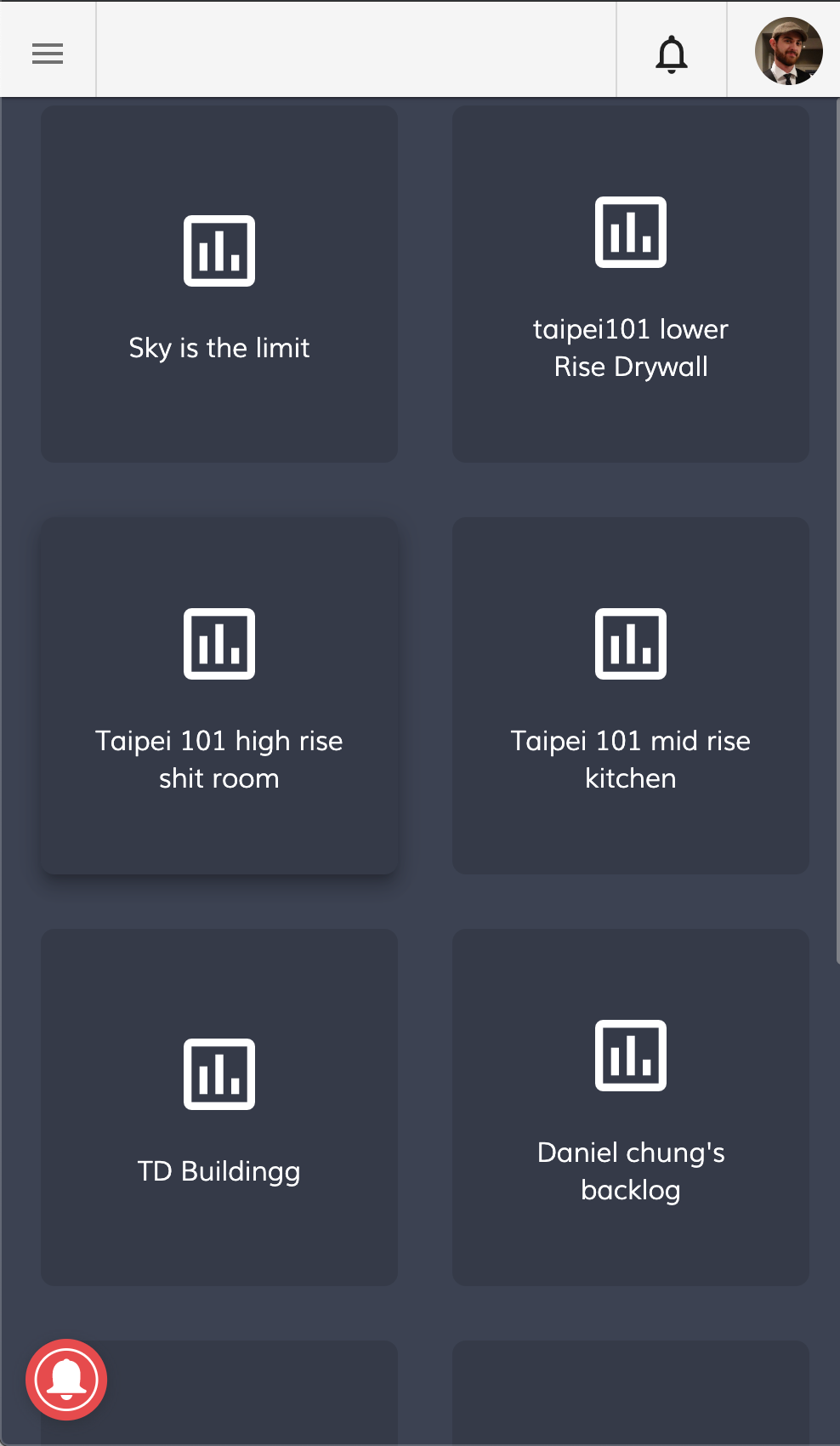
Current Project Overview Mobile Screen
The current screens offer the user little information about what information is contained in each project, and the only association you can assume between projects is the similarity in project name.
There is also no way to search or sort the projects which has the potential for being problematic, especially as projects
begin to scale.
begin to scale.
The Redesign
Based on the current design of the platform, there are various screens that follow a light and dark viewing mode. It is because of this that I decided to design both, therefore giving the user and opportunity to view their projects in a way that they prefer.
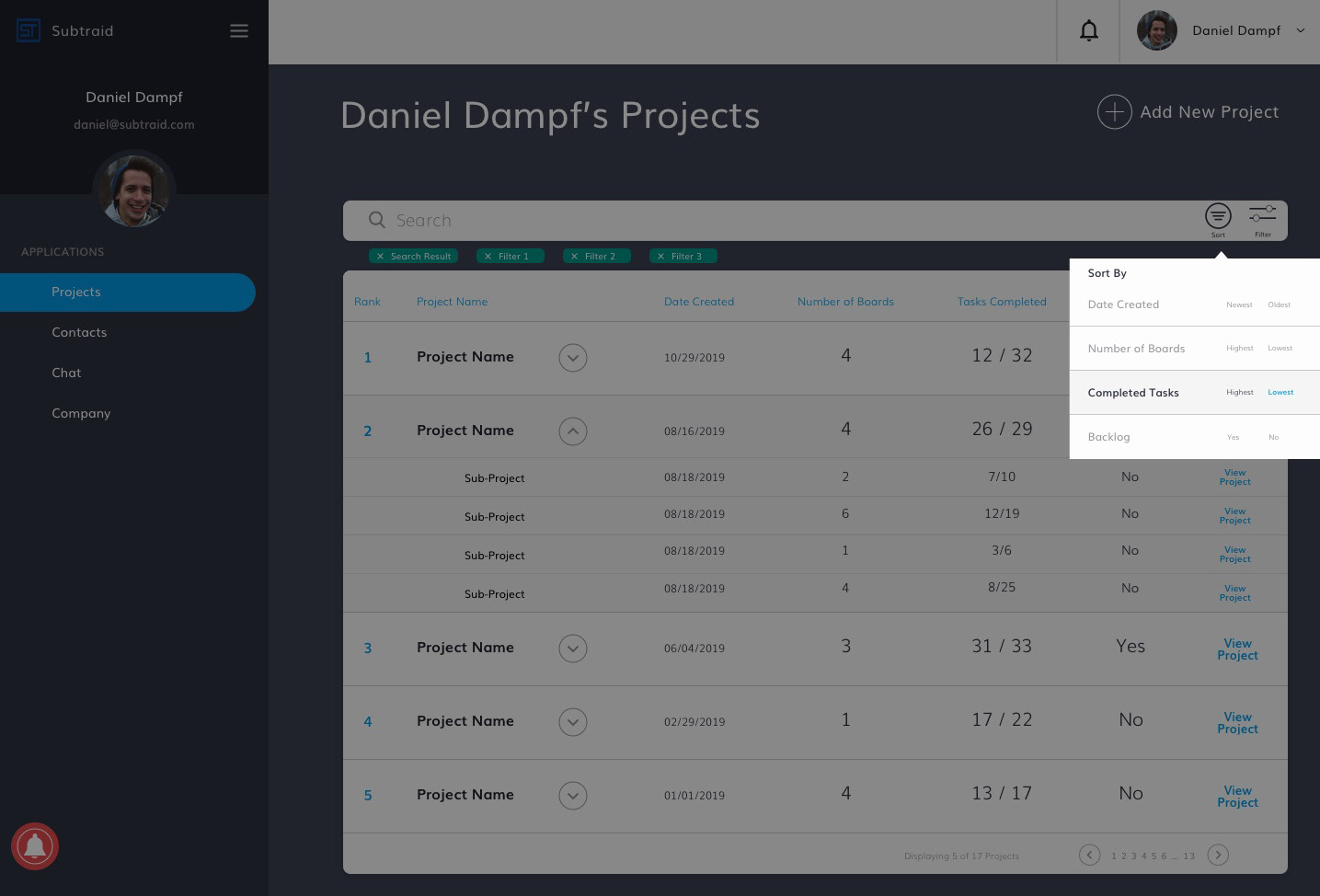
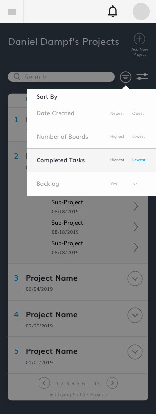
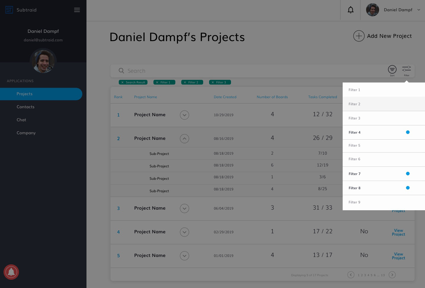
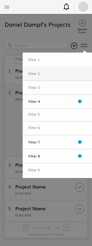
Below are the redesign screens, including the added features of the search bar and the filter bar. I also added a sort function because more information is being presented to the user, therefore it adds a quick way to organize information.
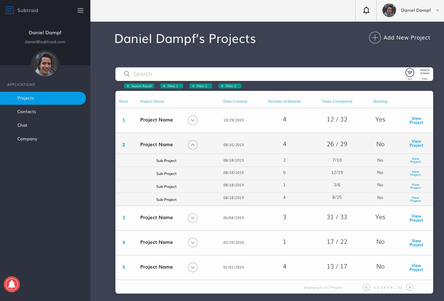
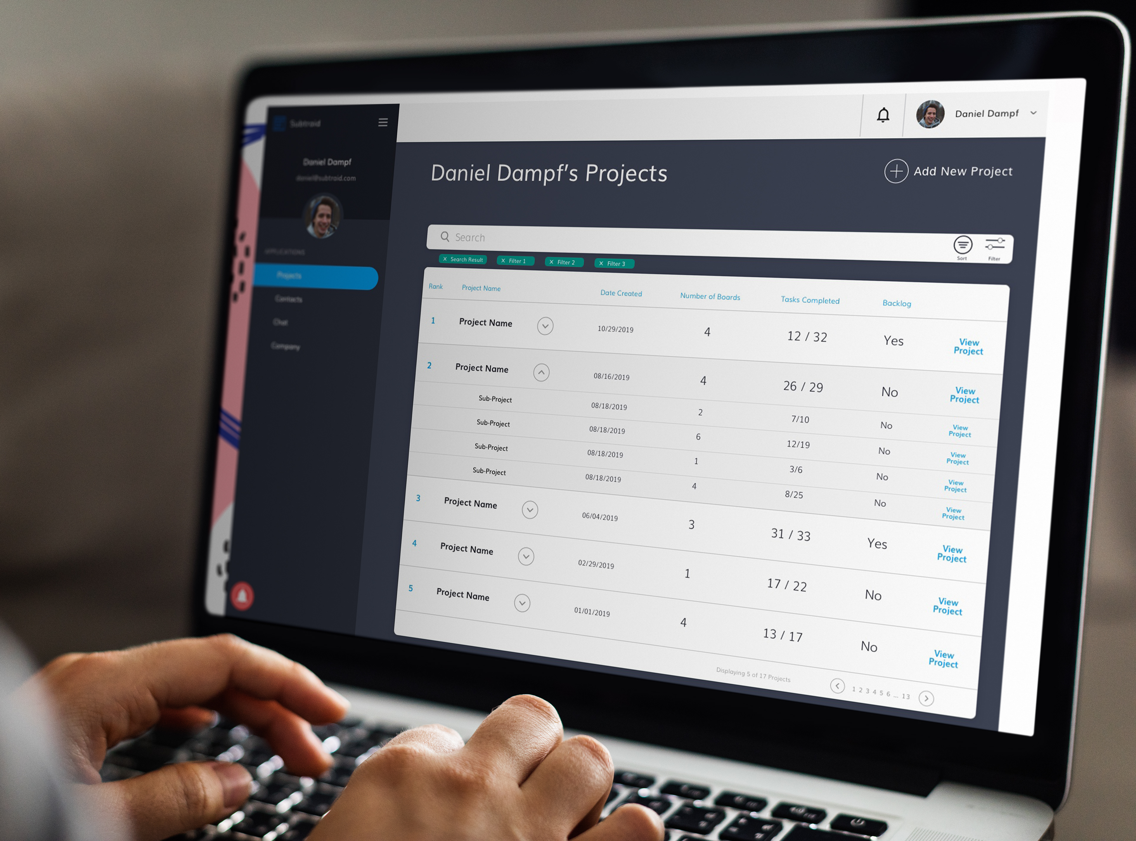
Dark Mode Desktop View

Light Mode Desktop View
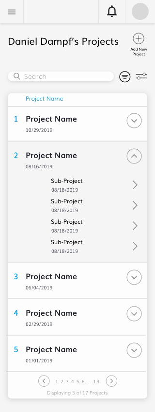
The transition to a list view allows the viewer to not only view many projects at a time, but effectively view and sort relevant information such as date created and number of assigned tasks completed.
The expansion of list items clearly indicates the relationship between parent and sub-project, and the user can access both levels from this screen.
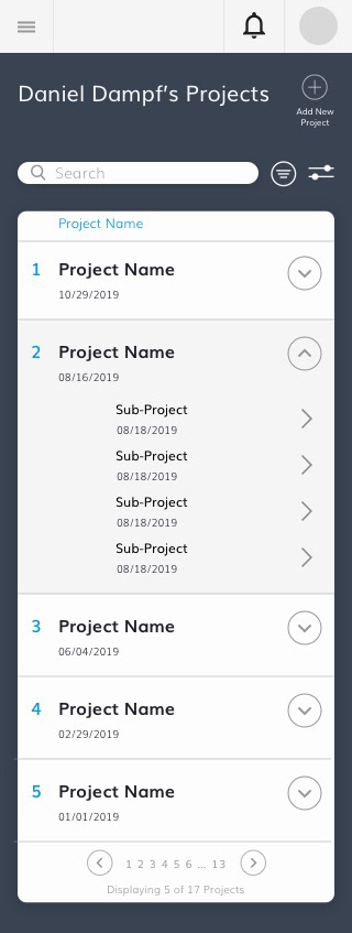
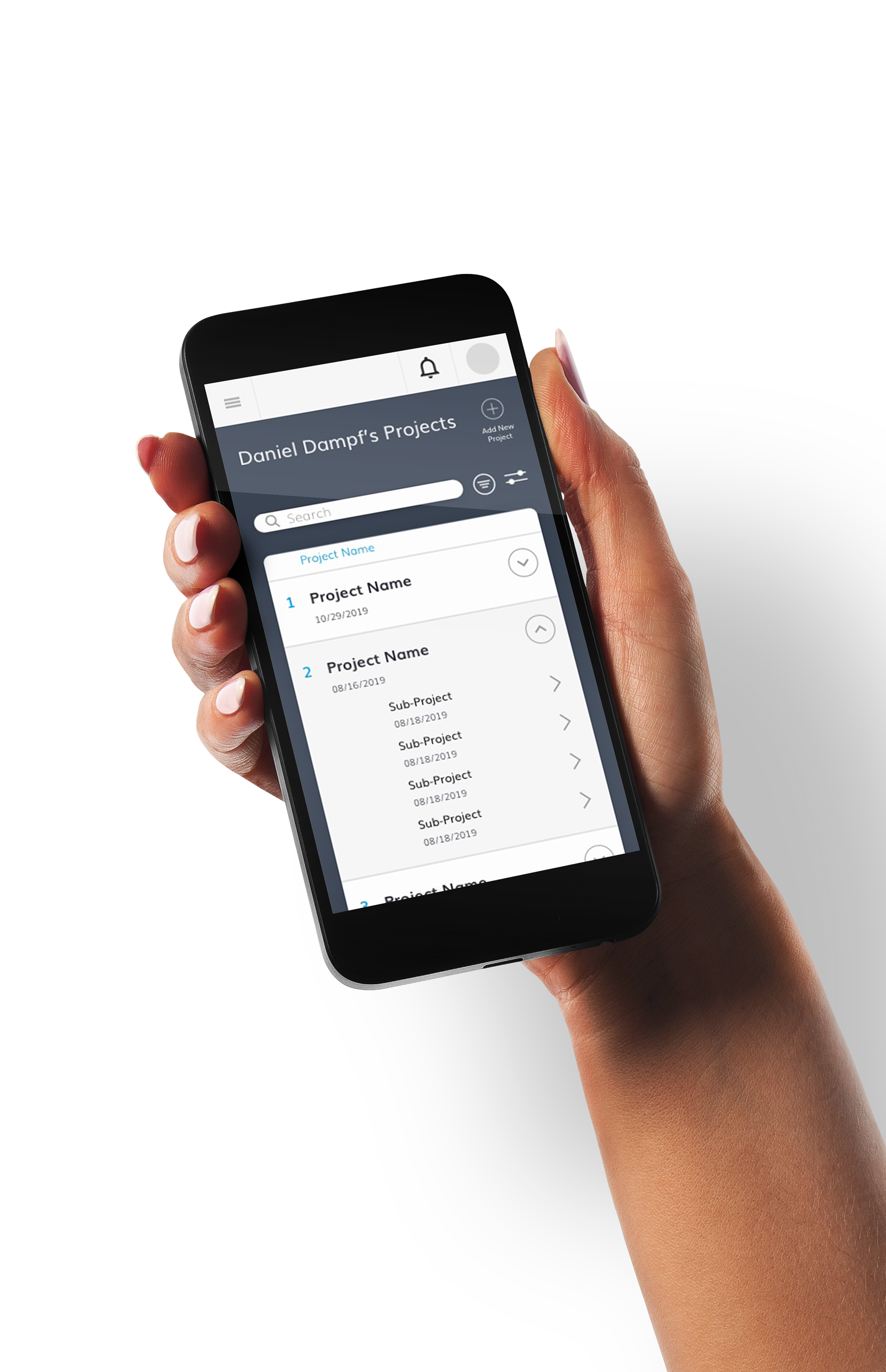
Dark Mode Mobile View
Light Mode Mobile View
The mobile translation includes some information, and matches the desktop view. The general layout is quite similar to create consistency, yet a different platform calls for a different design.
Filter & Sort
The filter and sort options, though similar, need to take different factors into consideration. The key take away from designing these were to include a versatile enough design that can expand or shorten the list without dramatic visual changes.