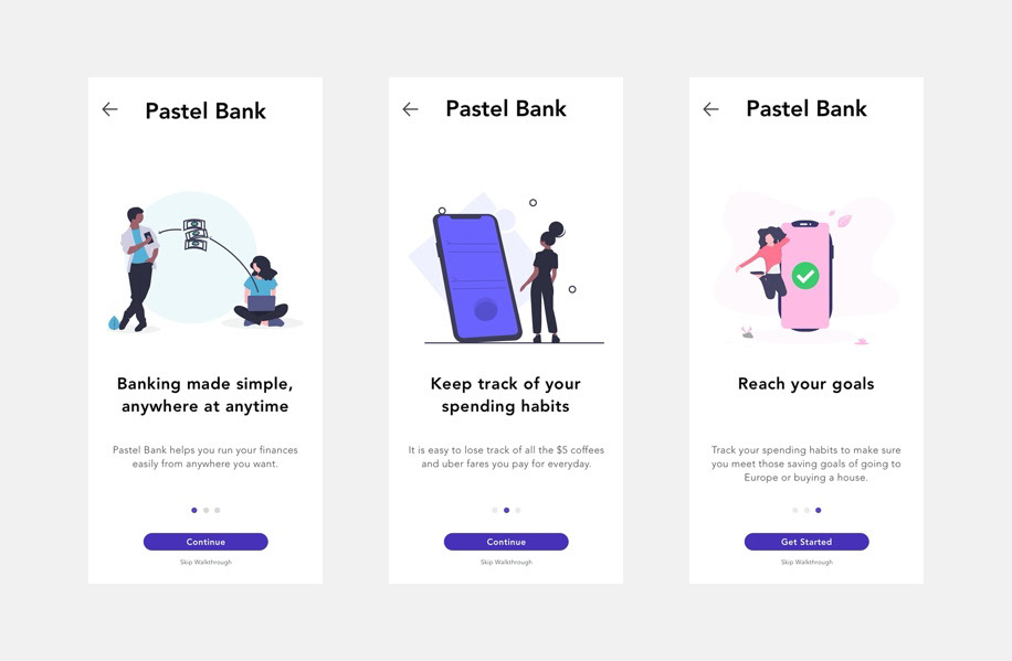
What is Pastel Bank?
Pastel Bank is a financial institution that served as a prospective client for a design sprint challenge during my studies at BrainStation. The week long challenge demanded that my team and I complete a fully-built clickable prototype that represents the data and insights found throughout the week.
The initial project was completed halfway through my studies, therefore I decided to take another look to reflect on my experience and see how I would do it differently after I successfully completed the program.
The initial project was completed halfway through my studies, therefore I decided to take another look to reflect on my experience and see how I would do it differently after I successfully completed the program.
Why a Redesign?
In the weeks following the conclusion of Pastel Bank's design sprint challenge, it was important for me to continue the iterative process that follows the testing of version 1.
Maintaining the brand requirements, I managed to update the solution that encompasses the opportunities for improvement that were discovered during the first round of usability testing, while enhancing the areas that we succeeded. I wanted to use this as an opportunity to practice and apply my user interface (UI) design skills, while exploring more effective ways of displaying the same information.
To learn more about the initial sprint process check out my full case study here:
The Screens


Design Decisions
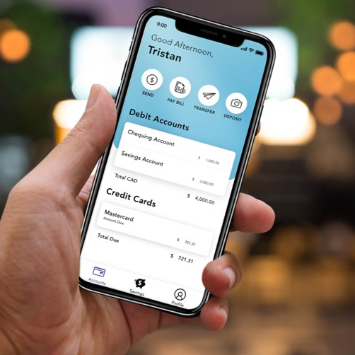
Dashboard
The dashboard contains the same quick action buttons there were present in the first round of testing, however the accounts page has been simplified and brought to the forefront of the experience. This is because individuals reported wanting to be able to see their accounts without having to go searching for them because in most scenarios, that is the purpose for the
experience initiation.
experience initiation.
The hamburger menu has been replaced with a global navigation bar because of existing patterns surrounding iOS apps, as well as allowing for a clearer understanding of the information architecture.
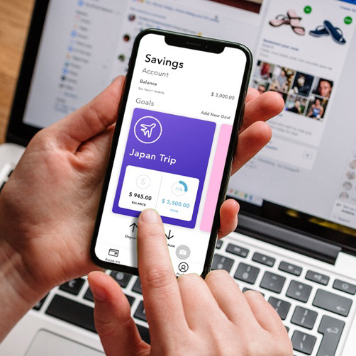
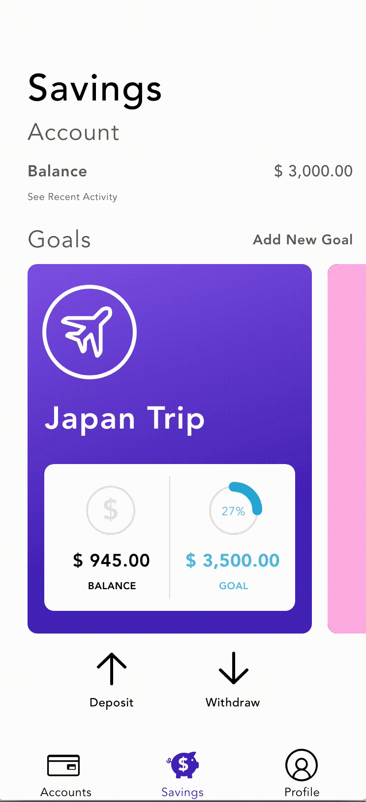
Savings Goals
A crucial aspect to incorporate into the savings goals was the deliverance of the appropriate information, allowing for the user to fully understand what is happening without having to tap into another screen. Maintaining the percentage visualization, but adding the current balance and total goal amounts gives the user all of the information that they need while providing perspective.
The screen real estate is utilized more effectively by including the account balance, along with quick action buttons to withdraw and deposit from a particular fund. By increasing the size of the cards and introducing a carousel allows for quick viewing and easy action without the need to transitioning to another screen.
Savings Goal Card
Many of the original components of the original design, however they are enhanced with additional information that help the viewer identify what they are looking at. The balance information is included on this screen, along with the same quick action buttons from the previous screen. The graph now provides more information about the transaction history by offering a lateral scrolling timeline, while also including the original list view from the previous iteration.

Exploration with Animation
Utilizing micro-interactions can help give the user more information about what is happening on screen and how the two screen relate to one another.
It also makes the overall experience more fluid and enjoyable because it feels as though you are being guided rather than navigating it yourself.
This was my first experience experimenting with animation on a project, and I find it can take a project from good to great. When considering a user flow, considering what information the user sees is not the whole picture. When designing for a user, it is important to consider how they are taken from screen to screen, and whether or not it can help orient them throughout the experience.
Wrap Up
Ultimately, I thoroughly enjoyed the process of taking the user feedback and creating different and more effective ways of displaying the same user experience. This was a challenge that I posed for myself and I am extremely happy with how the transformation progressed.