Patient Sense is a proposed solution for Patients First, looking to connect patients to their medical practitioners using a platform that allows for flexible scheduling. The purpose of this project was to explore various research strategies and develop a solution in the healthcare sector aimed to aid the patient experience.
Duration: 3 Weeks
Role: UX Researcher, UX Designer, UI Designer
Problem Statement
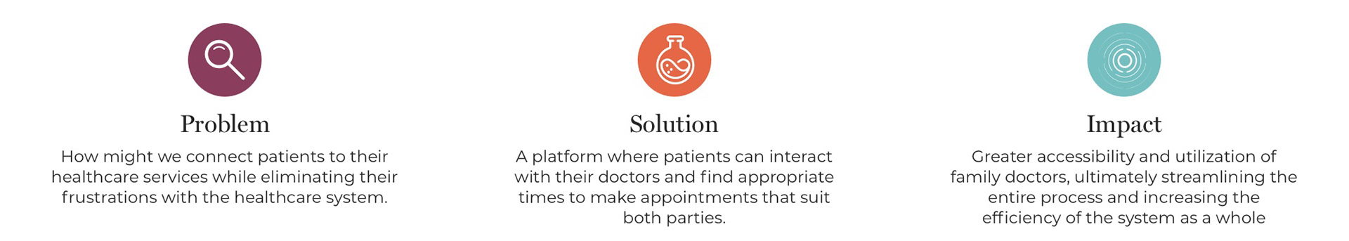
Patients First is a government led initiative aimed at improving healthcare for patients. The initiative aims to place people and patients at the centre of healthcare by more deeply understanding needs and experiences while improving patient outcomes.
A mobile application geared towards solving patients' frustrations towards the healthcare system would allow for a step forward in improving access, connecting patients to services, informing patients about their health and protecting all Ontario Residents.
Research Methods
User Interviews
Persona Development
User Journey Mapping
Information Architecture
Prototype Usability Testing

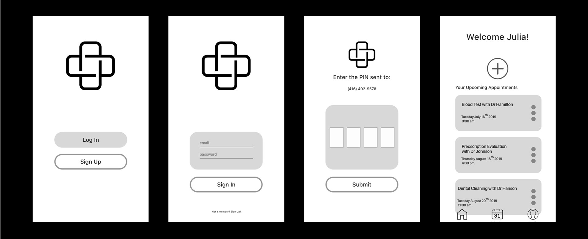
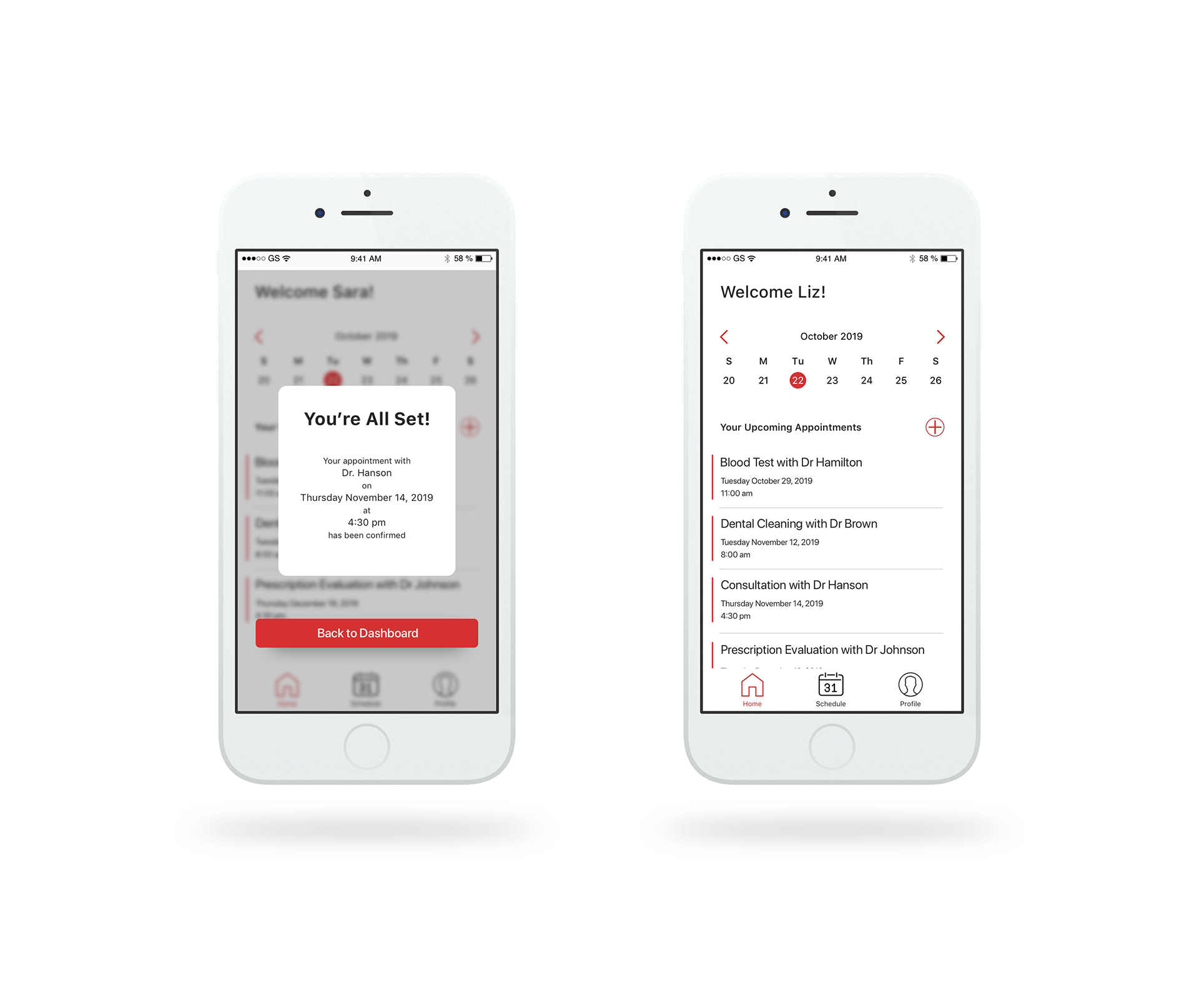
An example of the dashboard, featuring a calendar and list view showing upcoming medical appointments
Through user interviews, I explored how patients interact with their family doctors and why they may choose to utilize walk-in clinics instead of their general practitioner. I spoke with 10 people in order to gain insights on their needs, motivation and frustrations to help shape the app solution.
Through the interview process I was able to identify key themes that encapsulate pain points that patients experience.
User Interview Extractions
Accessibility
Patients value their time highly, therefore is was a prevalent theme to see patients irritate when they feel as though their time was being wasted. This was seen through excessive wait time and not being able to book an appointment in a reasonable amount of time.
Negative Interactions
Patients expressed their dissatisfaction with the demeanour of their healthcare professionals describing them as being ride, short tempered and judgmental. This lack of compassion, as well as a feeling of being rushed through appointments lefts patients with negative associations of going to the doctor
Standard of Care
Patients described being less than confident in the medical diagnosis and treatment they were provided with, leaving the impression that they do not need to seek medical attention at all. Events such as performing a google search of symptoms in front of the patient, being misdiagnosed resulting in unnecessary care, and lack of action plan when faced with a medical condition leave patients believing that they can treat themselves at home.
Following my user interviews, I synthesized our findings and were able to create a persona and user stories helped formed a great foundation to move into feature ideation and prioritization.
Meet Liz
Liz represents the population of target users, and personifies the design process to ensure that the user is always at the forefront of the process.
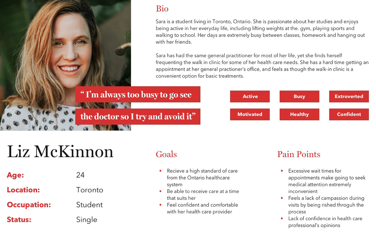
The Epic
Sara would like to have more control over her schedule by booking appointments online, and keep track of upcoming appointments with various healthcare professionals.
User Stories
Using user stories helped me identify areas of exploration and functionality that would directly help Liz accomplish her goal of choosing her best suited appointment.
"As a patient..."
I would like to check into my appointment online so that the admission process is streamlined.
I would like to make appointments online so that I can pick a date and time that works for me.
I would like to see a calendar view of available appointment so that I can be aware of my upcoming appointments.
I would like to get appointment reminders so I do not forget my appointment.
I would like to see my appointment history so that I can keep track of my previous visits.
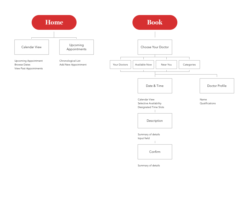
Information Architecture
The organization of information helps ensure that the user can flow through the information in a logical and intuitive way.
It also serves as an informational roadmap that outlines the interaction between various functions throughout the experience.
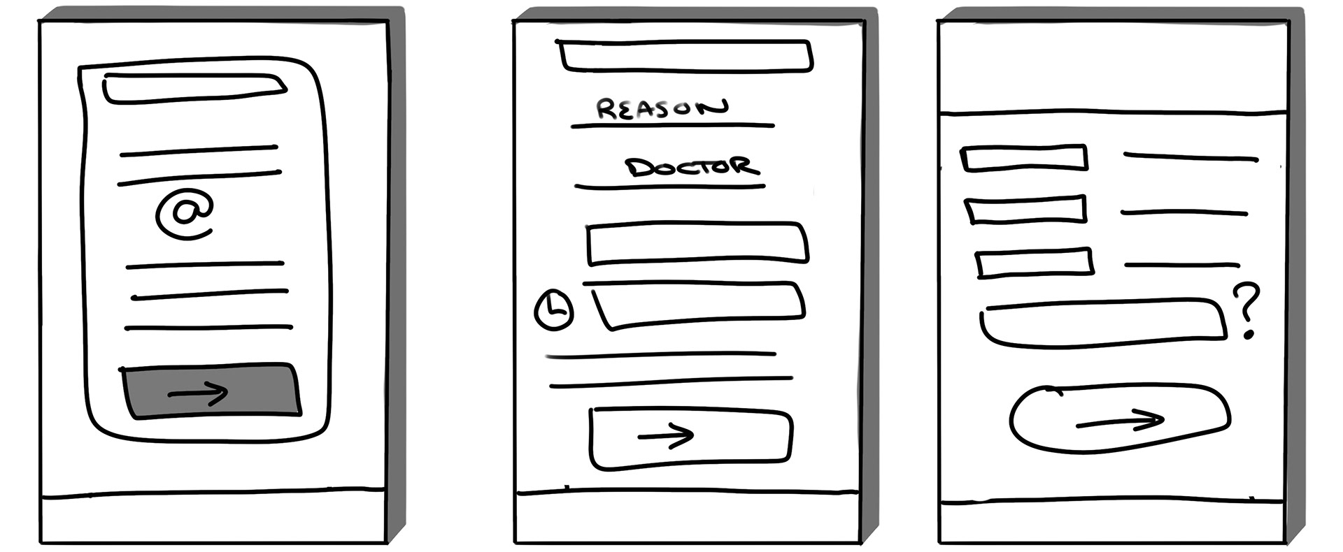
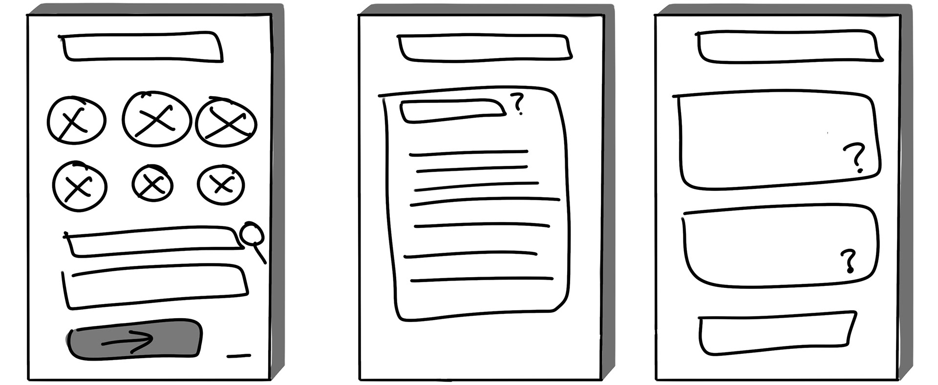
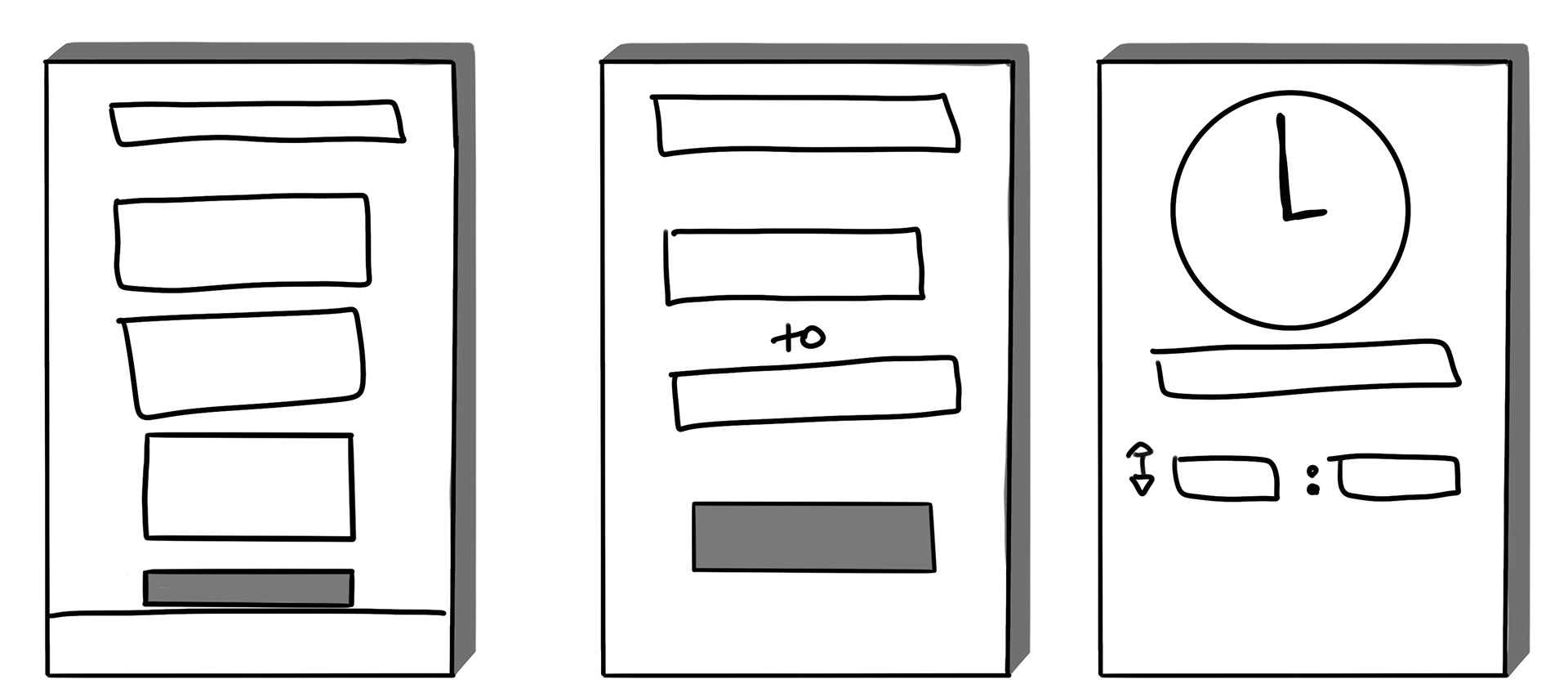
Sketches
The ideation process included the exploration of various patterns, specifically to organize and group information.
First Iteration

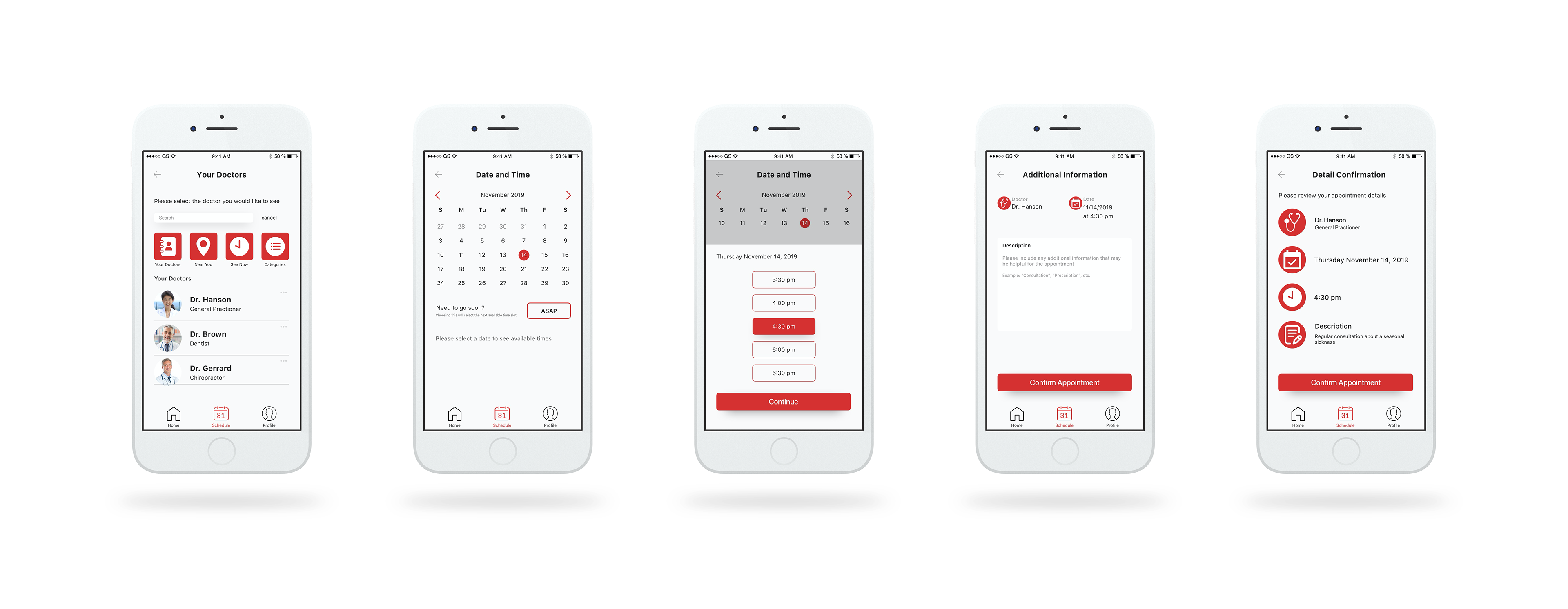
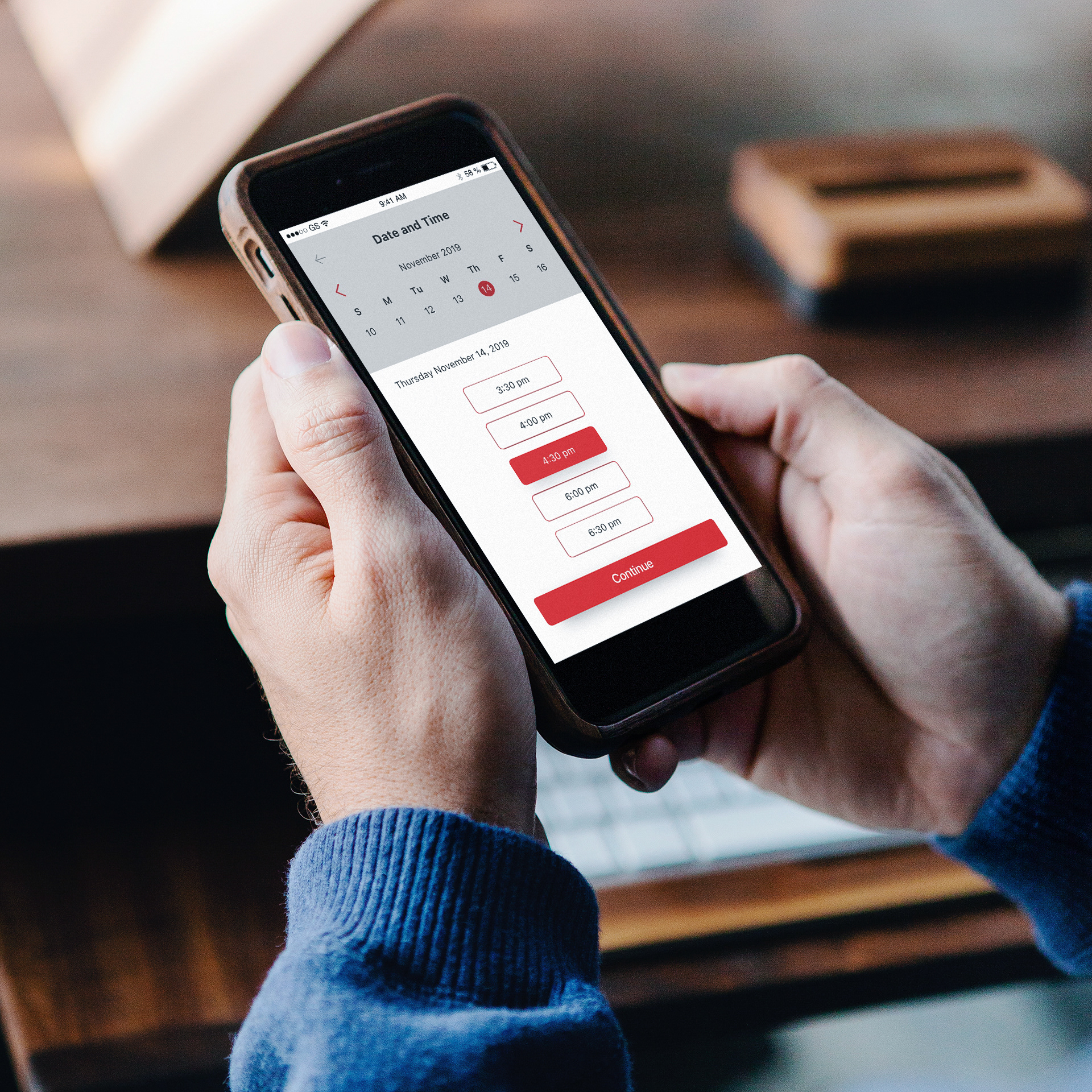
Appointment Booking
Log In and Dashboard
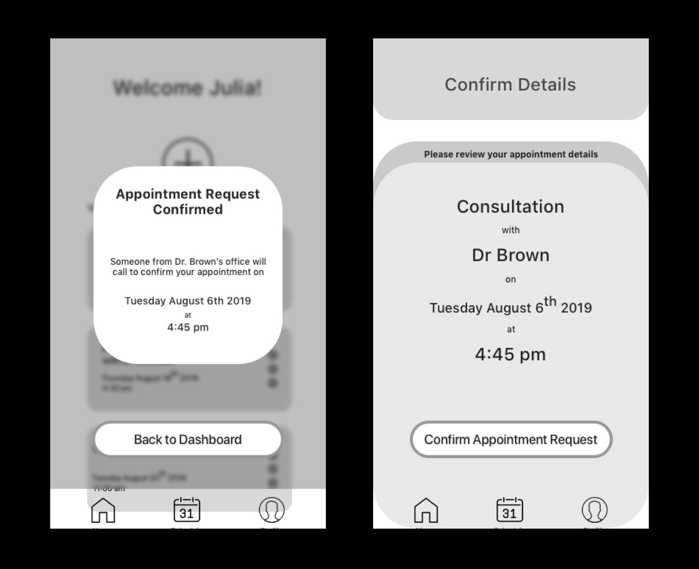
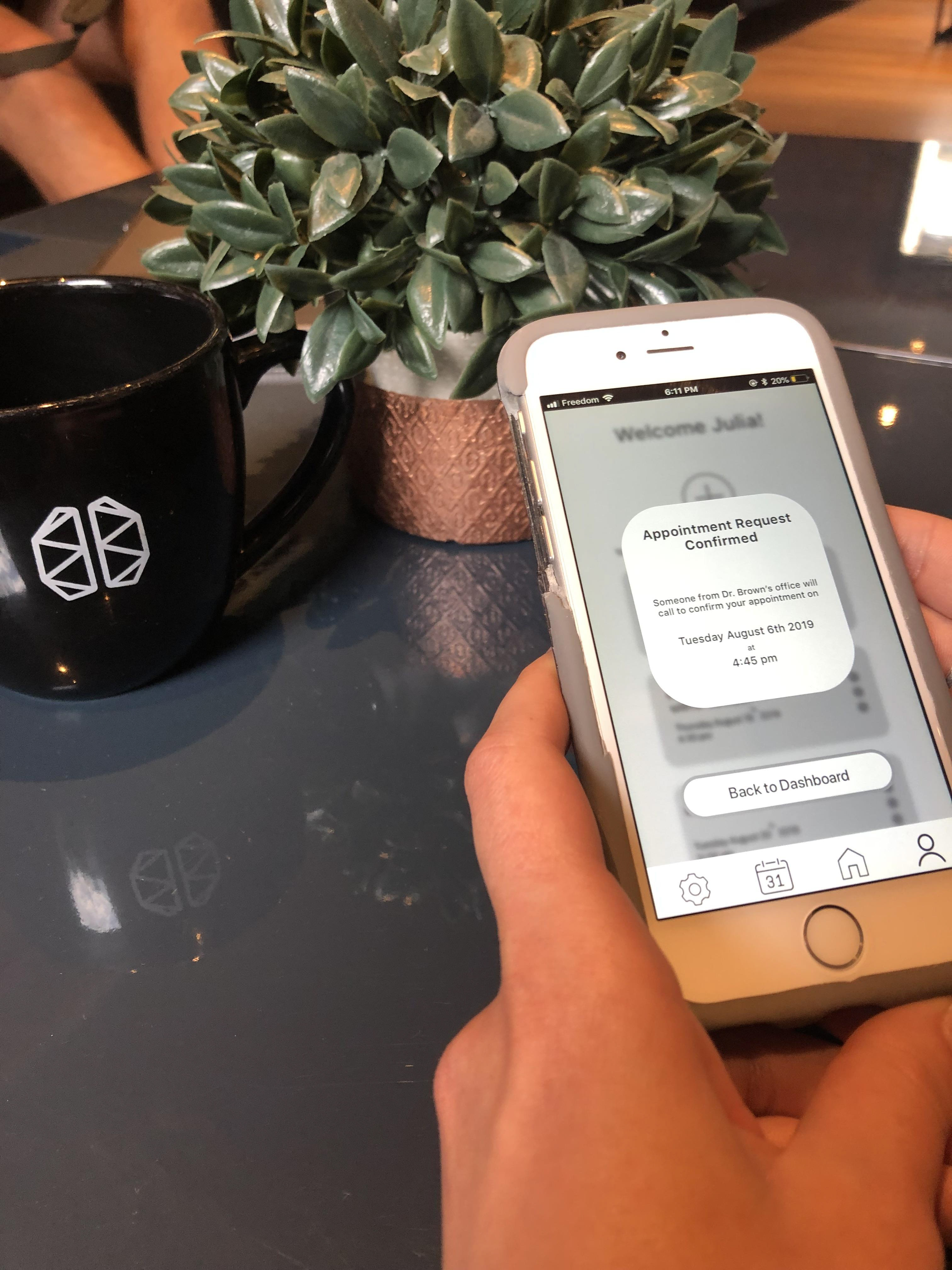
Confirmation
Usability Testing
After two round of moderated usability texting with 10 participants, all them were able to complete the specified task correctly. I was able to extract valuable information about the process through asking interview style questions and asking the participants to complete a think-aloud activity.
Key Insights
More Information
All users specified that they had questions throughout the process that could be easily answer through on screen prompts and instruction. Many users wished to be able to access more information if they wanted it, however did not necessarily need it at all times.
Clearer Language
Users were confused about the process of the booking, not knowing if they had a confirmed appointment or has sent an appointment request. This was easily fixed through using more concise and consistent language throughout the experience.
User Feedback
Many users were unsure if they had successfully completed the action due to lack of action feedback. The introduction of micro-interactions to show the users information about system processing and action easily resolved this issue.
Colour Injection
The choice of colour was intended to keep the design simple, professional and accessible for all future users. The specific hue of red that is used symbolizes primary actions because it is vibrant, easy to read, but most importantly is meets the Web Content Accessibility Guidelines (WCAG) AAA classification.

Final Design
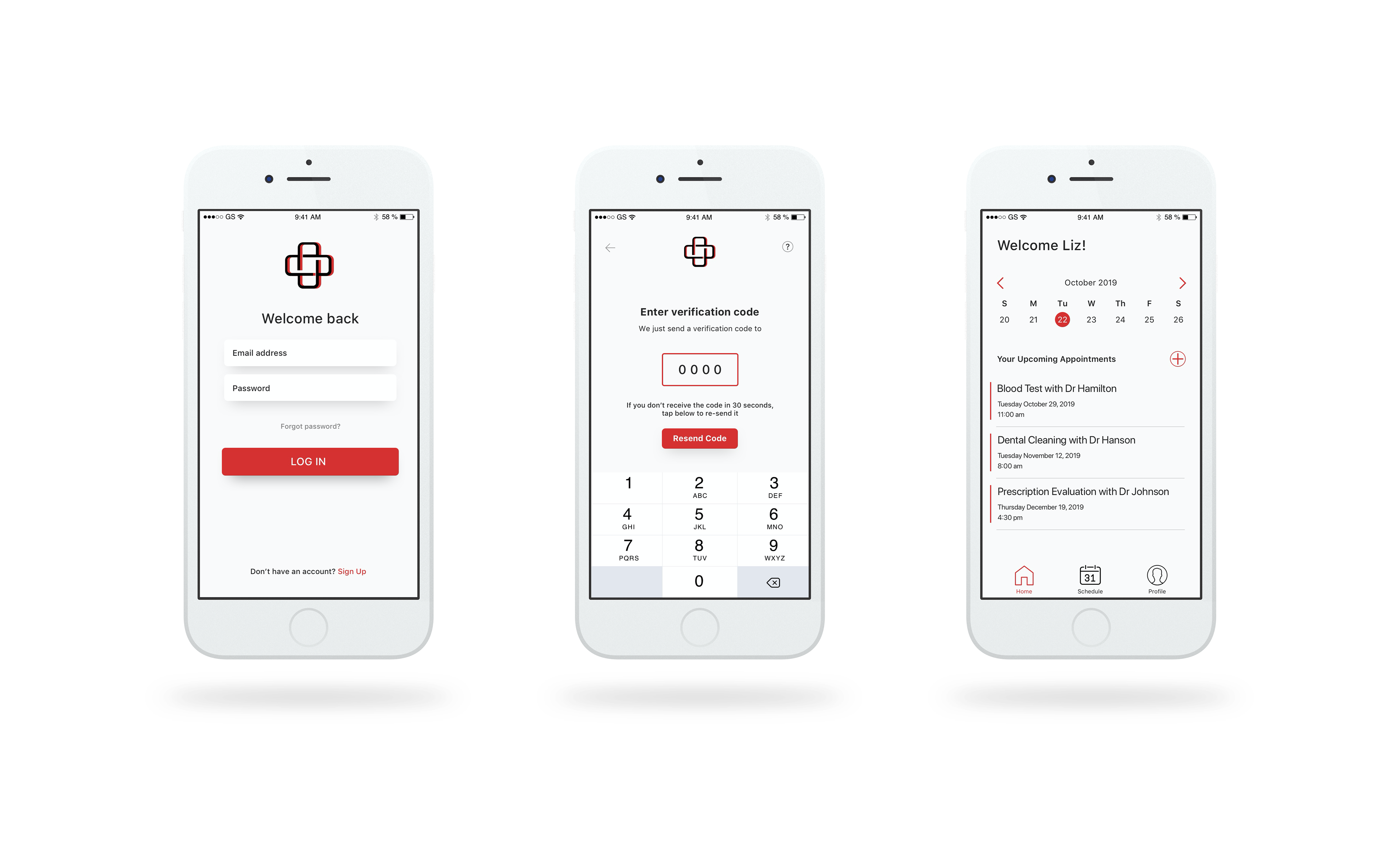
Log In
Confirmation